Making a good PowerPoint presentation
A PowerPoint Presentation is a part of the Microsoft Office tool that is used to make a presentation on a particular topic/idea. Ppt (the abbreviated term) is basically used when you want to convey an idea to a large number of audiences. Each ppt consists of a number of slides which can be used to present an idea. There are various tabs available in a ppt tool through which you can insert images, flowcharts, animations, etc. Although the web is flooded with lots of presentation on various ideas displaying creativity, not all catches the eyes of the reader. There are several reasons behind this:
- the ppt is unable to grip the user for a long time.
- there is too much content flooded in each slide.
- the colors used in the presentation are too glossy to the eyes.
- too many insertion of irrelevant images and animation.
There are lot many other reasons which can be listed but the main reason behind a boring (rather bad) presentation is that the users are unable to connect with the presentation.
The Do’s
Making a good presentation needs a lot of practice and understanding. However there are some basic rules which must be followed:
1) Keep it short and simple:
Often you will see presentations loaded with lots of content in a single slide. The consequences is that the audience becomes disinterested at the very thought of reading such long sentences. As you are unable to retain your audience, you presentation becomes a failure. So, the best strategy is to minimize the number of words in each slide. The lesser you write and emphasize, the easier it is to grab the audience’s attention. The exaggeration can be carried while you are explaining the idea. In this way you can keep your audience engrossed.
Ways to achieve this:
a) Write in bullets:
When you introduce your idea in the form of bullets or rather points, the audience will take the pain of reading all that is written. The impact is also stronger than the huge content. It is easier to remember short sentences/idea than longer ones. Condense your ideas in the form of points and highlight them using bold.
b) Speak through images:
Sometimes a single image speaks lot more than the lengthy contents. It is also true that people connect more through images than words. If you insert images in your slide that can convey your message more smoothly than words, then it is appropriate to use it. Images attract the attention of the audience more than anything else.
c) Introduce a mix of sentences and images:
Sometimes it becomes necessary to implement both images as well as sentences into your slide. During those times it is a good idea to introduce both of them. But do remember not to clutter your slides with too many things. 1 image and 2-3 short sentences in the form of bullets is sufficient for each slide.
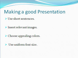
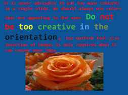
2) Use colors and backgrounds that are appealing to the eyes:
Using backgrounds and color that are too glossy and revealing is not advisable. The bad effect is that the attention is distracted from what is written or presented in the slide. Using yellow over green or blue over red is an example of a bad color selection for your slide. Contrasting is good but the color should be chosen in such a way that user have a good impression on what is being written or conveyed.
3) Use fonts of appropriate size:
Too big or too small fonts should be avoided. If your fonts are too big, then your presentation would be too lengthy. If your fonts are too small, the audience would have to put in a lot of effort to read what has been written. So an optimal font between 22-24 is good enough. Also do not attempt to use too stylish font style. Arial, Times Roman, Calibri and Verdana are some professional font styles are worth using.
4) Use flowcharts and graphs:
Whenever required use flowcharts and graphs to present your idea. Graphs are useful in tabular presentation where you are comparing different values. Try to put simple color and present it in the most decent way.
5) Always put the end slide for questions:
It is quite obvious that your audience may have some questions or doubts regarding your presentation. It is good gesture that you put the end of your slide for questions to make the audience feel that you have given room to their queries. It is always beneficial to be interactive as this will give you a chance to know what you have delivered to your audience and where are the areas for improvements.
The Don’ts
PowerPoint Presentation has a lot of advanced features inbuilt into it to meet the needs of the user. However, it is not a very good idea to use them all in a single slide. Experimentation is good till the point you want to make sure what is working best for your presentation. Here are some don’t which should be kept in mind:
1) Do not use too many transition. Transitions in ppt refer to the way or direction in which your ppt is moving from one slide to the other. There are many transitions available in the Animations tab of PowerPoint. It is wiser to choose the simple transitions to keep the focus on the content of the presentation rather than orientation.
2) Do not use too many animations in a single slide. It can be applied through Animation tab>Custom Animation. Insertion of animations is recommended for advanced users. Using too many animations can also cause distraction.
3) Do not put images for the sake of displaying it. If your image is something which can speak about your ideas, then only put it. If you can’t find images to match your content, then better avoid it.
4) Do not make your presentations too lengthy so that by the time the user reaches to end, the interest is all gone.
5) It is nice to put videos in between the slide but care should be taken not to insert more than one per presentation.
6) Do not use too many colors for your heading, subheadings and content. Creativity should be applied in making your presentation appeal the audience but not in the blending of too many colors.
7) Do not make any grammatical mistakes in your slide. As ppts contain very less content so care should be taken that the content is perfect with respect to the punctuation, articles, grammar, etc.
The above are just basic guidelines to be taken care of. Presentation is all about presenting your best in the least time. So, if you ever happen to make a presentation, do follow these.

Like it on Facebook, Tweet it or share this article on other bookmarking websites.