A home bright and cheerful
What’s that single factor capable of lending an aura of best of the aesthetic effects to your home with a single stroke? The answer is Colour.
Color helps in making a house bright and cheerful. They are capable of transforming darkness in to light. They are capable of changing the boring dullness in to brightness. Colors transform gloominess into cheerfulness and drabness in to beauty in a jiffy. Probably the fastest way of remodeling a home that would result in a very noticeable change in the way a home will look is
to paint.
There are some colors which elicit a wave of emotions, an instantaneous and visible change in moods and physical changes. Owing to this reason interior designers attach a big importance to color.
Warm and Cool.
Colors are divided into two big divisions. They are warm colors and Cool colors. There are colors that stimulate and excite and there are colors that relax and calm.
- Reds, Yellows and shades of Orange are known as ‘Warm colors.’
- Blues, Greens and Purples are known as ‘ Cool Colors.’
The most emotionally intense of all the colors is Red. Red raises the heart beat. Increases blood pressure ultimately causing a speedy breath. Above all, there is no color that is as capable as Red to draw human attention. This is the reason for using Red headlines for an important news in the news papers. Red is also capable of increasing the appetite. And due to this reason Interior decoration Gurus recommend Red color for dining spaces.
Yellow inspires. Enhances concentration and quickens metabolism. But interior designers advise not to overdo Yellow.
Blue has the quality of calming, soothing and relaxing of nerves. Blue creates an atmosphere of serenity and tranquility. Peculiarly Blue is also related with ‘Melancholy.’ Despite this, Blue is the most preferred color in the building and construction parlance Green and Blue have many similarities, though Green is the most sought after color for not only the Interior decorators but also, Nutrition experts. The reason for this is Green enhances appetite. Because many foods in nature are Green in color. Imagine, how your heart swings and sings when you see a verdant landscape.
Violet is more popular as an unpredictable color. It was observed Violet’s unpredictable exuremely opposite qualities in humans. But children are fond of this color.
White is a neutral color. It makes the things bright and dazzling. But it has to be used sparingly. Too much of white will make things stark and sterile. White is virtuous n the sense it goes well with any color.
The color which is warm and calming is Brown. It’s earthy. Brown signifies thickness and strength.
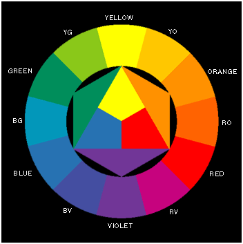 Color Wheel
Louis Prang is the originator of the color wheel which is in wide usage and acting as the color guide for Artists, Architects, and interior decorators all over the world. The color wheel is also known as Prang Color wheel after its inventor.
Primary colors:
These are red, blue and yellow in the Prang color system They are referred to as primary colors because they cannot be made by mixing other colors.
Secondary Colors:
When two Primary colors are mixed in equal proportions, the resulting colors are known as Secondary colors or Binary colors.
Yellow + Blue = Green
Blue + Red = Violet
Red+ Yellow = Orange
When a Primary and neighboring Binary colors are mixed in equal proportions, the following intermediate colors are produced:
Yellow + green = Yellow green
Blue + green = Blue green.
Blue + violet = blue violet.
Red + Violet = Red violet.
Red + Orange = Red orange
Yellow + orange = Yellow orange
The three Primary colors, three binary colors and six intermediate colors form the outer circle of the Prang color wheel.
When two binary colors are mixed , the resultant color is known as a Tertiary color.
Green + orange =Tertiary yellow.
Orange + violet =Tertiary red
Violet + green =Tertiary blue
When two Tertiary colors are mixed in equal proportions, a quaternary color results.
Tertiary yellow + Tertiary Red = quaternary orange
Tertiary Blue + Tertiary Red = quaternary violet
Tertiary Blue + Tertiary yellow = quaternary Green
Different colors, different effects
Different colors have different characteristics.
Different colors have different effects on the people. They should be used according to the particular purpose of a room or situation. For example, the bed room where one rests and sleeps ,should have quiet and soothing colors such as blue, blue-green, pink, light yellow and cream .Dining space needs a color scheme that helps enhance appetite. Earlier in this article I mentioned that shades of Red have the quality of enhancing the hunger.
The living room should have cheerful colors such as pink, green, orange or yellow.
For bath room the color scheme should be fresh and stimulating colors like, cream, white or light pink are ideal. So ultimately it all amounts to the conclusion that color scheme should be in tune with the purpose of the place.
Its essential to remember that all colors have three basic characteristics. They are, hue, intensity and Value. These three factors are detrimental in establishing the effectiveness of a color. The other factor to be kept in mind is about the knowledge of Harmony in color. Harmony creates an impression of unity. The same effect of Harmony is produced in music field also. Though there are seven musical notes, all different from each other, if properly arranged, the outcome would be a sonorous melody.
In a similar manner, with a proper combination of the colors a sense of unity can be achieved. Harmony related colors can be achieved by two ways . By the use of monochromatic or analogous colors.
As the very name indicates, Monochromatic colors can be achieved through a single color. It means a color’s different shades or values are used. In the analogous harmony neighboring colors in the Prang color wheel are used. By employing monochromatic and analogous color schemes, for the home a sense of continuity is achieved. The opposite of Harmonious color harmony is contrasting or complementary harmony. In the contrasting harmony, colors located opposite with each other in the Prang color wheel are used.
Double complementary harmony
Double complementary harmony is yet another way of achieving an amazing pleasing effect to the home. This harmony is achieved by mixing two adjacent colors on the Prang color wheel.
Split complementary harmony
This color harmony is achieved by mixing a primary color with either side of its complement.
Triads
The colors forming the points of the four equilateral triangles in the Prang color wheel.
Some more aspects to be considered
Size of the room has to be taken into consideration by all means. For smaller rooms usage of light colors will create an impression of largeness. If a room gets too much of light, use a dark color. If a light color is used for a low ceiling, it appears higher.
The Mantra for a magical appearance of your home is simple common sense. Know the intricacies of color or bring in a professional. If you are not able to understand color psychology, explain the professional colorist in detail what you need. See the color charts or color swatches shown by the professional and convince yourself before giving green signal to the color professional.

Like it on Facebook, Tweet it or share this article on other bookmarking websites.